Kontur Agentur
Overview
A brand-led website for a bathroom-products agency.
Details
At a glance
- Project type
- Brand and catalogue website
- My role
- Designed and built the site, including a large product catalogue behind the brand presentation.
- Category
- Web experiences
- Status
- Live2026
- AI in the product
- No runtime AIThe website has no runtime AI feature.
What I did
- Shaped the brand-led presentation, navigation and treatment of imagery
- Modelled a multi-level product catalogue and the routes that present it
- Implemented the bilingual site with optimised media delivery
- Set up automated performance and visual-regression checks
AI in the process
Planned, designed and implemented with AI-assisted development. AI tools helped me explore approaches, draft implementation and tests, and review code. I decided the scope, the structure, what was tested and what shipped.
Built with
- TypeScript: Application code
- Next.js: Framework and routing
- Tailwind CSS: Styling
- next-intl: Norwegian and English routes and content
- Motion: Reveals and interface transitions
- Cloudflare R2: Object storage for catalogue imagery
- Playwright and Lighthouse CI: Visual regression and performance budgets
- Vercel: Hosting with pull-request based deployment
Visit website(opens in a new tab)Discuss a project like this
Next project
Boligplass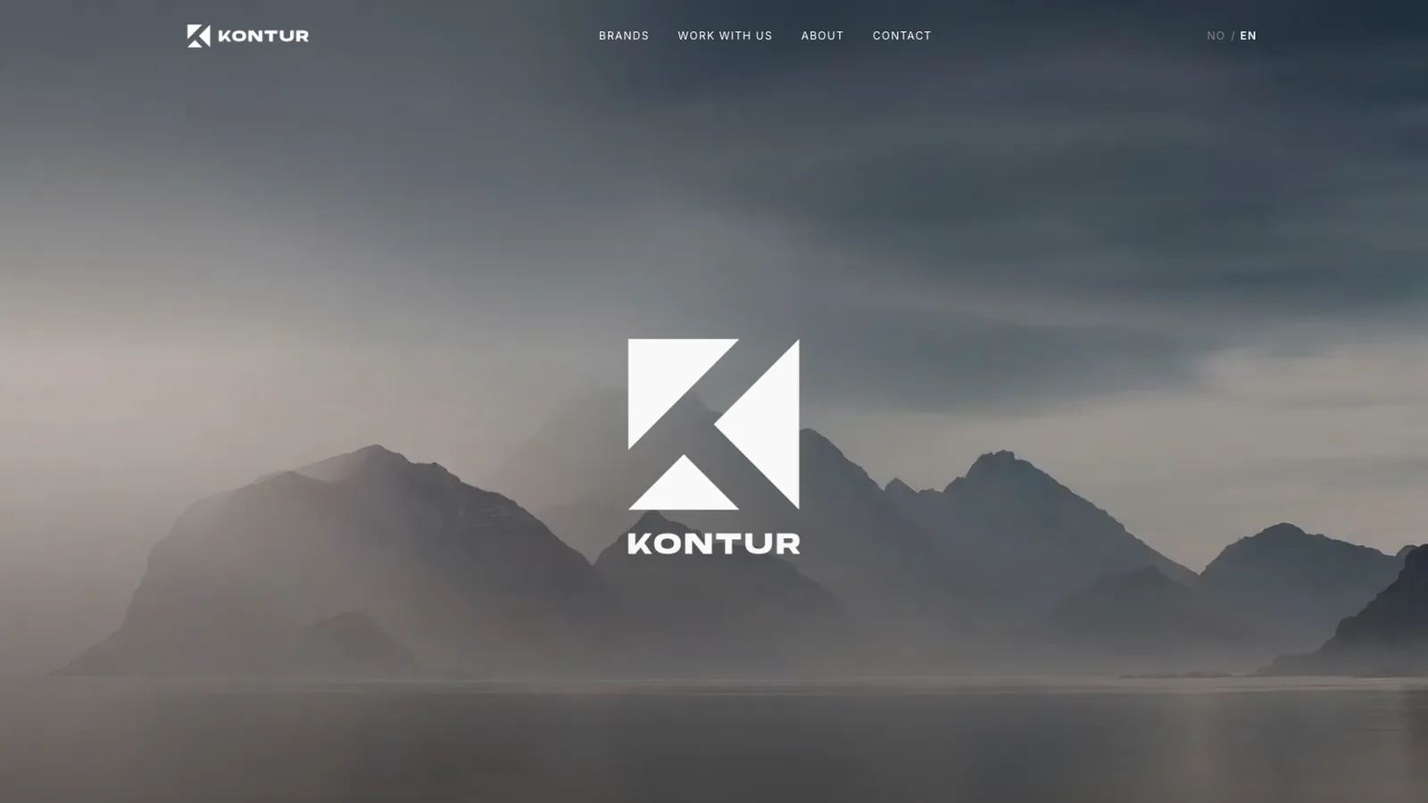
The need
An agency representing selected bathroom brands needed a website that presents those brands with the quality they expect, gives partners a way to explore a large catalogue, and works in Norwegian and English.
My contribution
I designed the presentation and built the site. The agency supplied brand assets, product data and copy. The brands, manufacturer relationships and sales belong to the agency; the case is about the digital presentation and the structure behind it.
Decision
The brand leads, the interface recedes
- Context
- The agency's value is the brands it represents, and their imagery is stronger than any interface element could be.
- What I decided
- Full-bleed imagery with a minimal navigation bar, and brand pages that let product photography carry the page.
- Trade-off
- Restraint puts more weight on image quality and loading, so every image is optimised and served from object storage at the sizes the layout needs.
How it works
- A catalogue of roughly 1,800 products in a four-level hierarchy, modelled as structured data and presented through one catch-all route with a path resolver.
- Catalogue imagery is stored in Cloudflare R2 and delivered at fixed sizes, bypassing the framework's image optimiser for the largest set.
- Norwegian and English share components and data through localised routes.
- Performance budgets and visual-regression snapshots run in CI on every pull request.
Validation and delivery
The site was reviewed at phone and desktop widths, checked against performance budgets and visual snapshots, and published through a pull-request workflow.
Outcome and reflection
Published a bilingual brand and catalogue website. The lesson I keep from it: a large catalogue is a data-modelling problem before it is a design problem, and a single well-designed resolver beats hundreds of hand-made pages.