Additional work
Overview
Three-dimensional product work, and logotypes drawn by hand.
Details
At a glance
- Project type
- Product visualisation and identity
- My role
- Built the scenes, lit them and cut the film. Drew every mark.
- Category
- Products
- Status
- Live2024–2026
What I did
- Built a hundred-component product in three dimensions from its engineering drawing
- Set the camera, the composition and the lighting on every shot
- Used AI where it saves time in the scene, and judged the result by eye
- Drew the logotypes in Illustrator, by hand, with no AI at any point
Built with
- Blender: Modelling, staging, lighting and rendering
- Adobe Illustrator: Every logotype, drawn as vectors
Next project
Wisr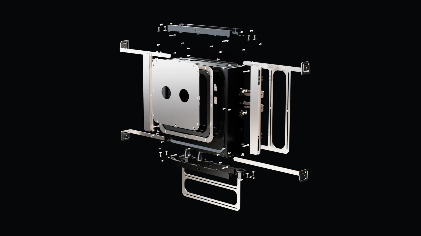
Building a shot, not a model
A product render is a photograph of something that does not exist, and the part people notice is never the modelling. It is the same thing they notice in a photograph: where the camera is standing, what the light is doing, and what has been left out of frame.
That is the part I already knew. Fourteen years of filmmaking is fourteen years of deciding those three things under time pressure, and none of it changed when the set became a scene file. A three-quarter view at eye height reads as a catalogue. Drop the camera, put a long lens on it and let the object run out of frame, and it reads as a thing in a room.
It starts, though, from something that is not a picture at all. The object here is a concealed leakage box, over a hundred separate components, and the work began with the manufacturer's own engineering drawing: plan, section and elevation, dimensioned and toleranced. Every part had to be built to that. A render that looks handsome and is a millimetre out is a rendering of a different product.
Decision
AI does the labour, the eye does the judgement
- Context
- In three-dimensional work there is a great deal that is simply time: getting a shape roughly right, roughing in a material, filling out a scene that only needs to be believable at the edges. There is also a small part that is the whole picture, and it is not time at all.
- What I decided
- AI is used freely on the first kind and never on the second. It does not choose the camera, the framing or the light. Those are set by eye, judged against how the shot should feel, and changed until it does.
- Trade-off
- It means the slow part of the work stays slow on purpose. That is where the difference between a render and a photograph lives, and no amount of speed further up the process buys any of it.
And then, the marks
The other half of this section is logotypes, and they are made the opposite way. No AI at any point. Illustrator, a pen tool, and as many versions as it takes.
That is not nostalgia. A mark is a few curves that have to be exactly right at two centimetres and at two metres, and the work is entirely in the deciding: which idea, which weight, where a line stops. There is no labour in it to hand off, the whole job is the judgement.
How I draw a mark
I look for the one idea the name can carry, and then I take away everything that is not it. Clean lines. Simple shapes. Nothing decorative, and nothing that needs explaining twice.
The test is whether the mark still works in a single colour, small, on a van door and on a phone screen. Anything that only survives at poster size and in full colour is not finished.
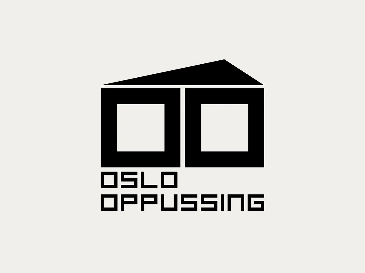
One idea each
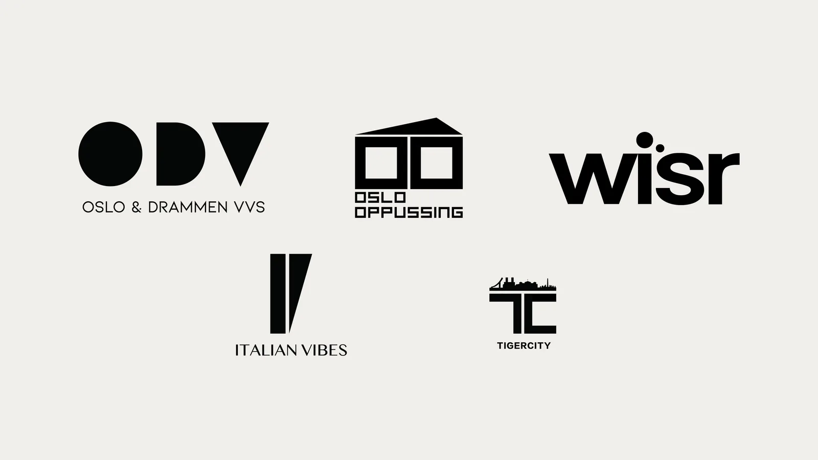
Oslo Oppussing is a renovation business, so the mark is a house, but only the parts of a house you would draw if you had two seconds: a roof and two windows, cut square so it reads as a plan rather than a picture.
Tigercity locks the T and the C together into a bridge deck, with the skyline running along its top edge, so the name and the place are the same drawing. Italian Vibes goes the other way: two strokes, one straight and one cut to a point, and a serif underneath doing the rest of the work.